Brownies

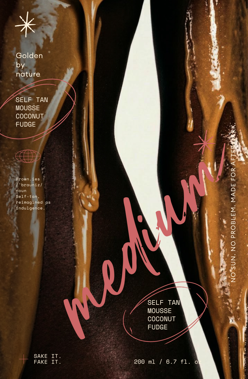
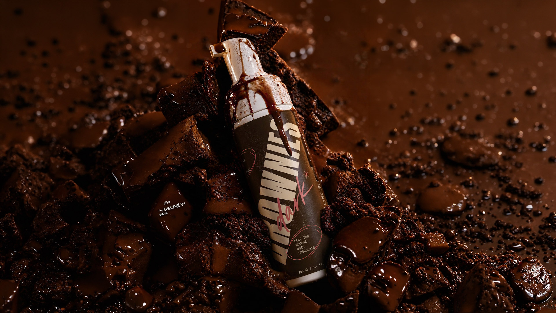
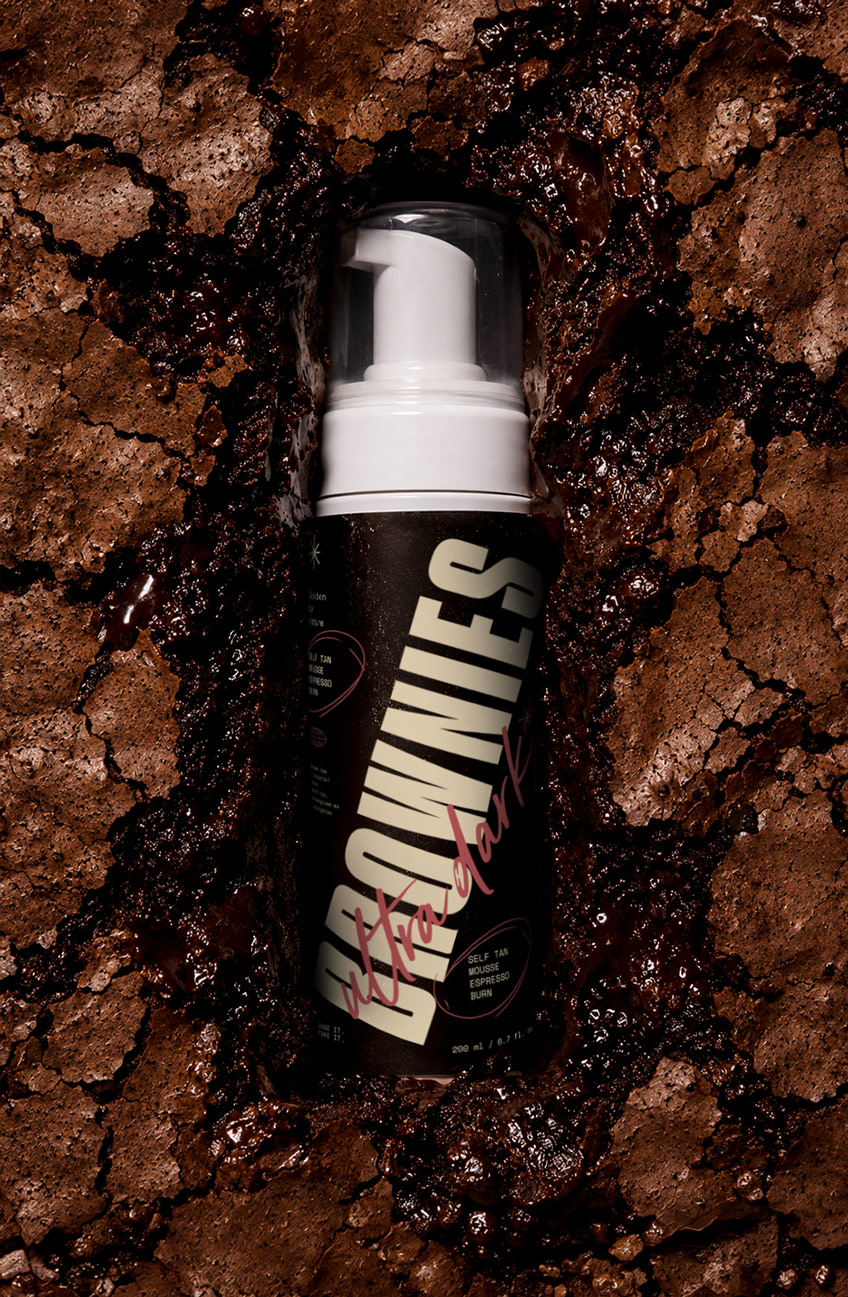
package design for brownies, self tan mousse

[Description]

Brownies is a self-tan concept built around a simple shift: tanning as indulgence. Instead of borrowing the clean, clinical codes common in beauty, the brand draws from dessert culture, rich textures and late-night cravings. The result is a playful, sensory identity designed to feel distinctive across packaging and digital imagery.

[SCOPE]

Brand Strategy / Naming / Visual Identity / Packaging / Art Direction / Concept Development

[The Challenge]

Self-tan brands often rely on the same visual cues: neutral packaging, polished beauty imagery and language centred on correction or maintenance. Brownies needed a different emotional entry point—one that could speak to a younger audience and remain recognisable in fast-moving, image-led environments.

[The Concept]

We positioned self-tan as a treat rather than a routine. The name Brownies created the foundation for an identity shaped by appetite, pleasure and excess. Oversized typography, dessert references and tactile imagery carry that idea across the packaging and art direction without making the product feel childish or generic.

[Outcome]

A complete self-tan brand concept with a clear position and a visual system spanning naming, identity, packaging and campaign imagery.

[Description]

Brownies is a self-tan concept built around a simple shift: tanning as indulgence. Instead of borrowing the clean, clinical codes common in beauty, the brand draws from dessert culture, rich textures and late-night cravings. The result is a playful, sensory identity designed to feel distinctive across packaging and digital imagery.

Blondie
Light #E3D1B2

Coconut Fudge
Medium
#BEAB85

Mocha Melt

Semi Dark #4D301A

Noir Chocolate
Dark #29160C

Espresso Burn
Ultra Dark #0E0501


Sun-kissed

Terracotta
#B55355
Blondie
Light #E3D1B2

Coconut Fudge
Medium
#BEAB85

Mocha Melt

Semi Dark #4D301A

Noir Chocolate
Dark #29160C

Espresso Burn
Ultra Dark #0E0501


Sun-kissed

Terracotta
#B55355

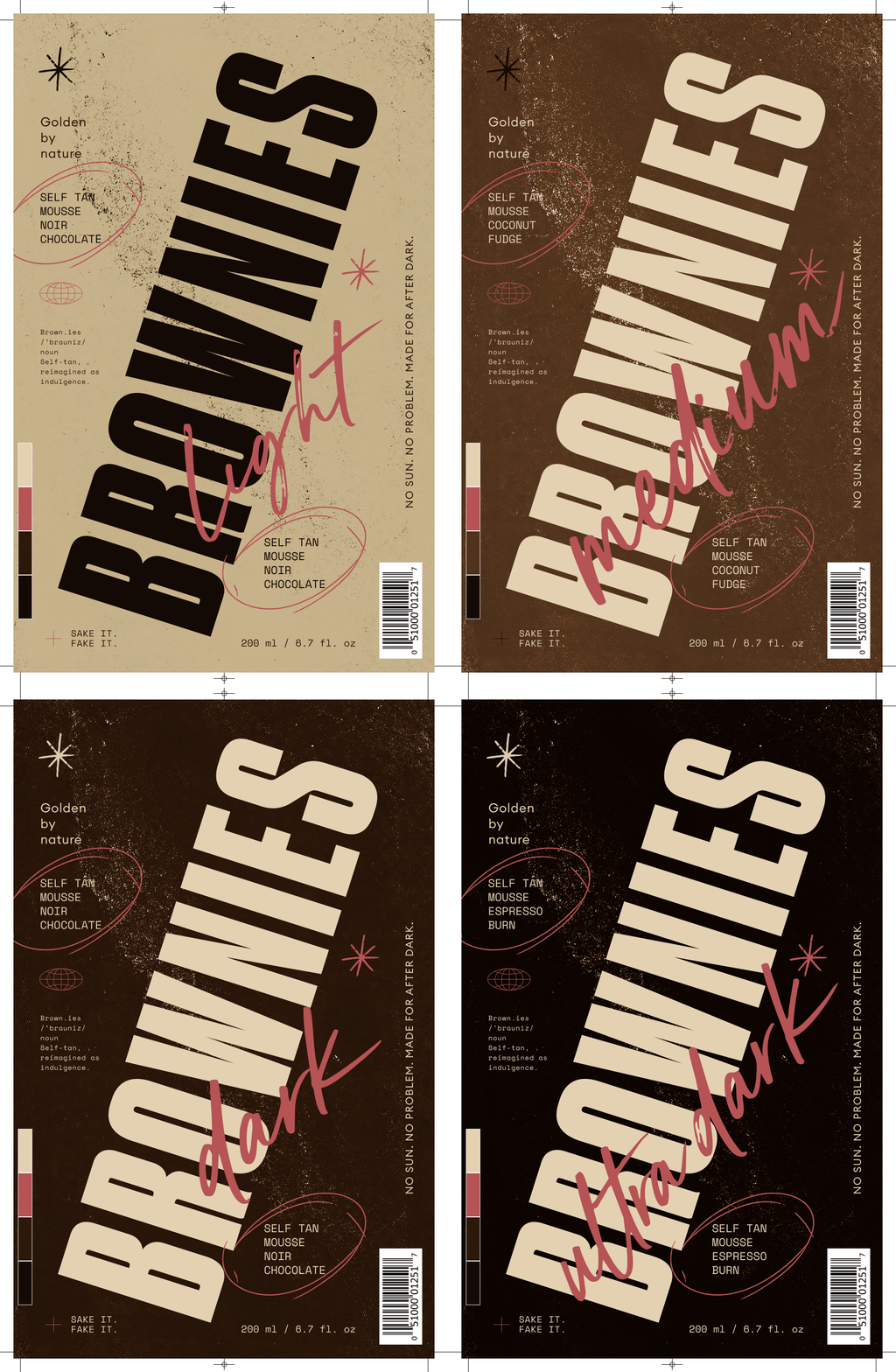
package design for brownies, self tan mousse

[The Idea]

What if a self-tan brand looked less like skincare and more like something you crave?

That question shaped the name, the packaging and the visual direction. Every element returns to the same idea: colour as appetite, texture as temptation and tanning as a small act of indulgence.

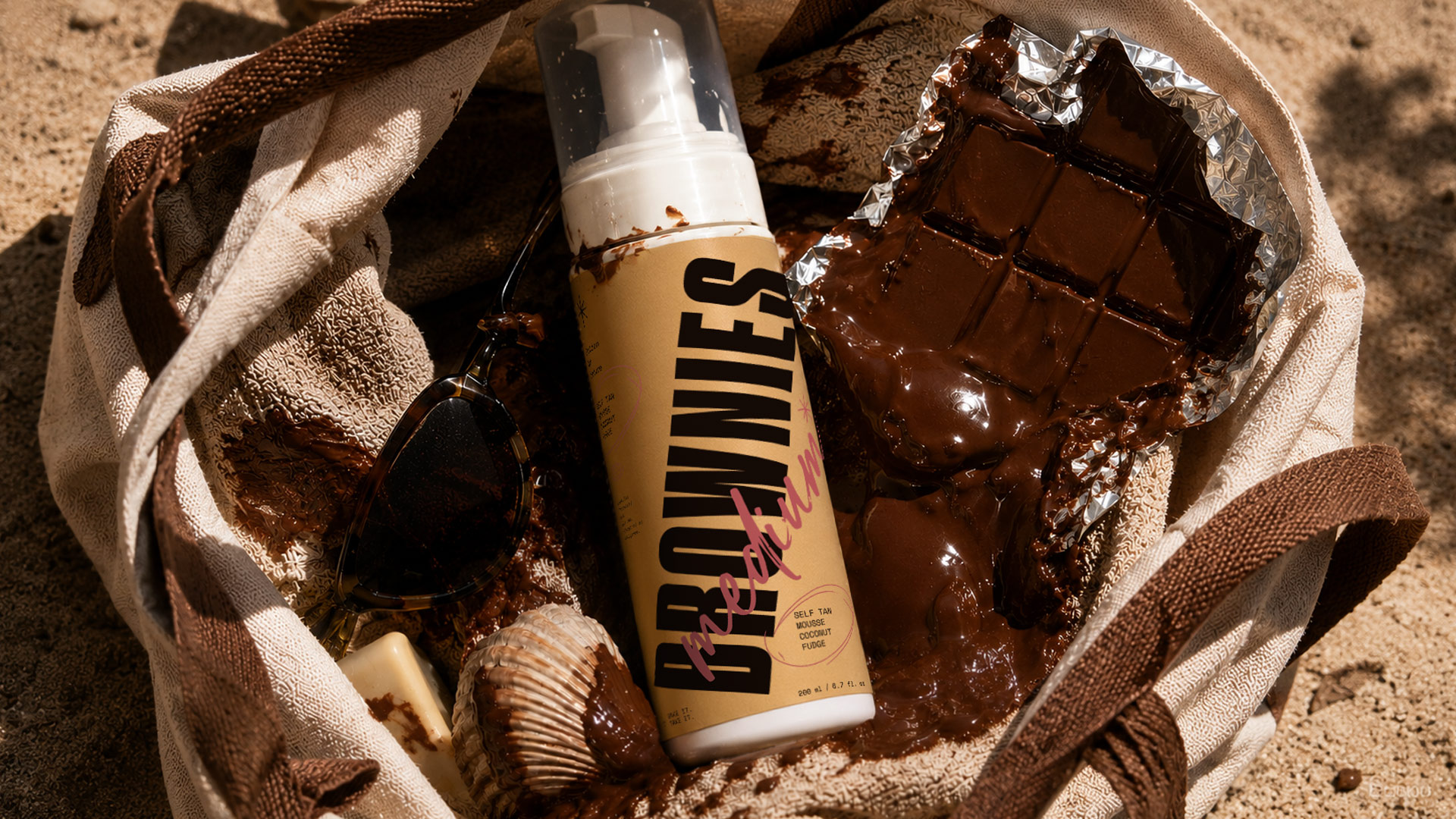
Self-tan mousse bottle, melted chocolate, seashell, and sunglasses in a beach bag on sand.

What we did

[Brand Strategy & Naming]

We defined the central proposition—self-tan as indulgence—and developed a name that connects the product directly to dessert culture.

[Visual Identity]

Oversized typography and bold compositions give the brand a consistent voice across product and promotional formats.

[Packaging Design]

The packaging brings together the name, type and sensory visual references in a format built to stand on its own.

[Art Direction]

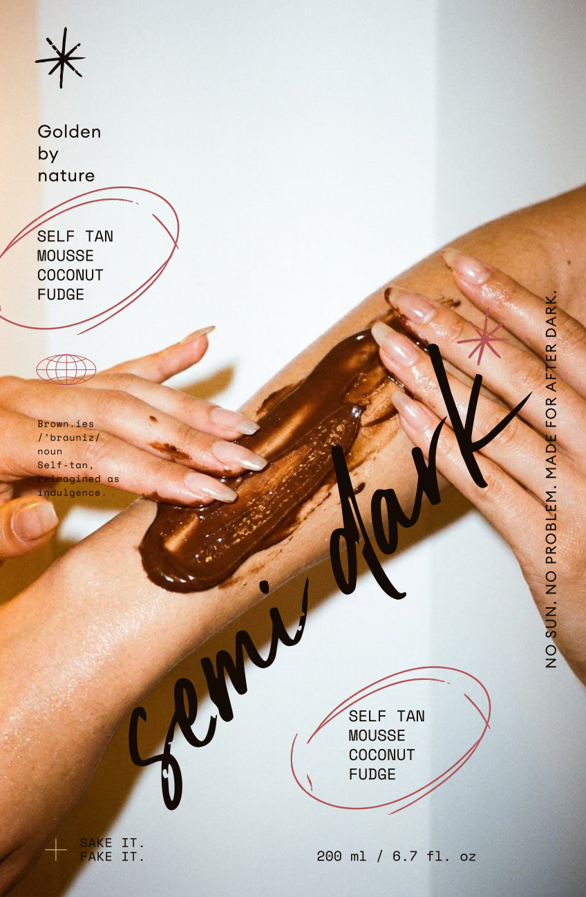
Rich textures, close crops and appetite-led imagery extend the idea beyond the pack and into a wider brand world.
package design for brownies, self tan mousse
poster design for brownies, self tan mousse

[LET’S build something bold together]

REady to make your vision a reality?

From digital designs to print masterpieces, we're here to help you to stand out and grow. Whether you have a project in mind or need guidance to refine your ideas, Fatzille is ready to collaborate.
Contact us