Cafe Europa
[Description]
[The Idea]
For a restaurant, the brand lives in repeated details.
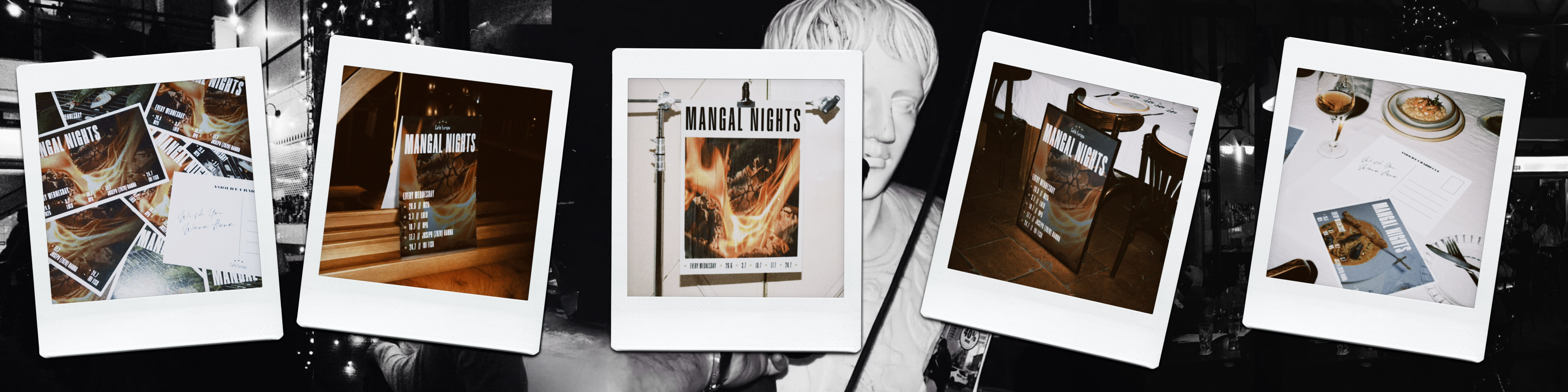
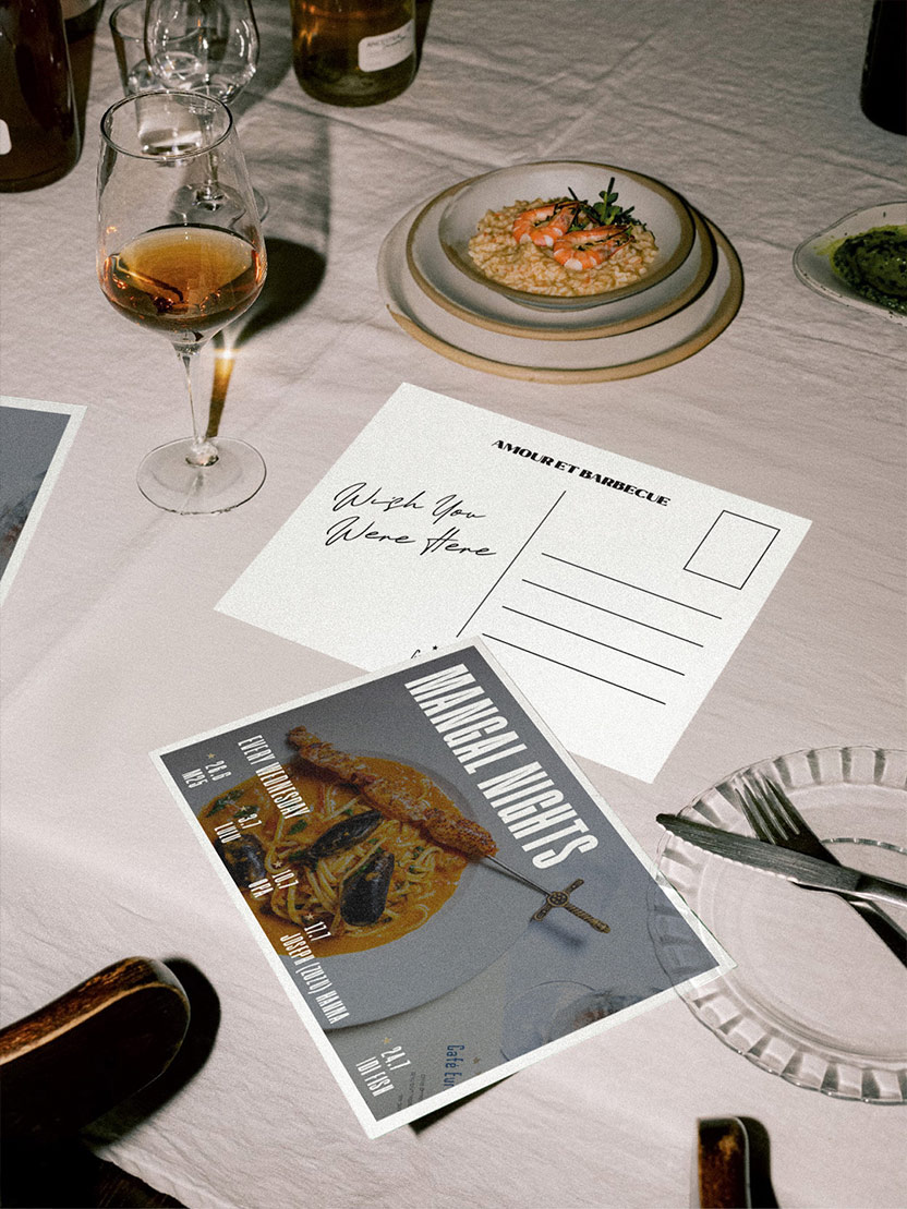
We carried Cafe Europa’s visual language into the pieces guests read, hold and share, building recognition through typography and composition rather than relying on the logo alone.
What we did
[Brand Applications]
We translated the existing identity into practical formats used throughout the dining experience.
[Menu Design]
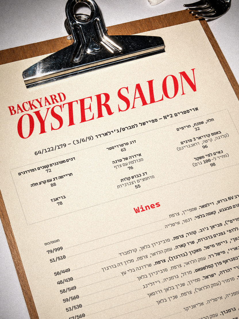
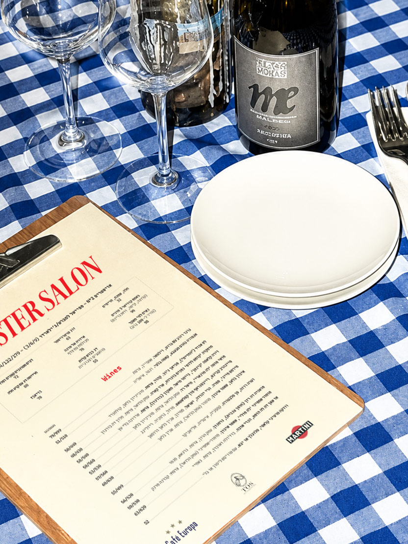
Menus balance changing information with a consistent typographic and editorial structure.
[Event & Social Design]
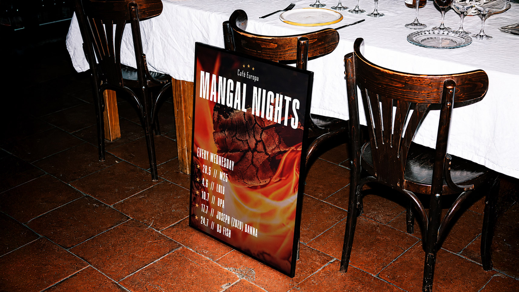
Special events receive their own visual emphasis while remaining connected to the venue.
[Print & Art Direction]
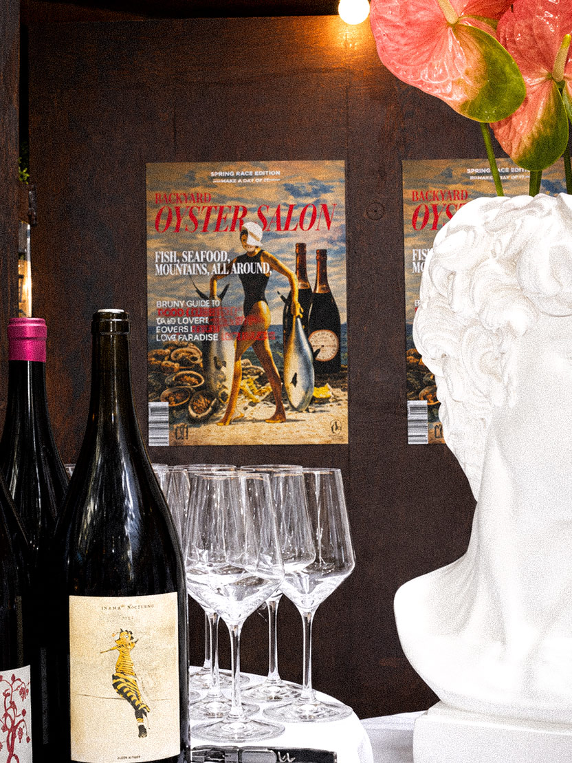
Layout, imagery and material choices help every application feel at home in the space.


[LET’S build something bold together]
REady to make your vision a reality?
From digital designs to print masterpieces, we're here to help you to stand out and grow. Whether you have a project in mind or need guidance to refine your ideas, Fatzille is ready to collaborate.
