lizo.ai
[Description]

[The Idea]
For an enterprise AI product, credibility begins with clarity.
We built lizo.ai so that the same visual logic carries from the first brand impression into the product itself, reducing the gap between what the company promises and what users experience.


Lizo Blue
#699FFF
Coconut Fudge
#00DCC7
Lizo Lilach
#D1B8FF
Lizo Purpke
#1E033E
Lizo Blue
#699FFF
Coconut Fudge
#00DCC7
Lizo Lilach
#D1B8FF
Lizo Purpke
#1E033E
Lizo Blue
#699FFF
Coconut Fudge
#00DCC7
Lizo Lilach
#D1B8FF
Lizo Purpke
#1E033E
Lizo Blue
#699FFF
Coconut Fudge
#00DCC7
Lizo Lilach
#D1B8FF
Lizo Purpke
#1E033E
What we did
[Brand Strategy & Identity]
We defined a visual system for an AI real-estate intelligence platform and its professional audience.
[Product Design]
The product structure organises complex information around decision-making and recurring workflows.
[UX/UI Design]
Clear hierarchy and reusable patterns make dense screens easier to read and navigate.
[Web Design]
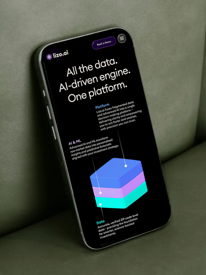
The website introduces the platform through the same visual language used inside the product.
[LET’S build something bold together]
REady to make your vision a reality?
