Marie Sharp’s

[Description]

[The Idea]
Heat is more than a specification. It is the experience people are choosing.
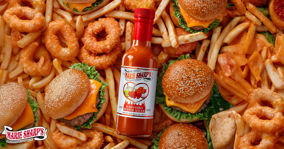
We made that experience visible, using spice level to guide users through products while colour and composition carry the character of the brand.
What we did
[UX/UI Design]
Heat levels give users a clear way to compare products and navigate the range.
[Web Design]
Product-led layouts combine strong colour with clear information and browsing paths.
[Information Design]
The Scoville scale becomes an understandable visual system rather than a technical detail.
[Creative Direction]
The visual language keeps flavour and intensity central across the digital experience.


[LET’S build something bold together]
REady to make your vision a reality?
From digital designs to print masterpieces, we're here to help you to stand out and grow. Whether you have a project in mind or need guidance to refine your ideas, Fatzille is ready to collaborate.
